What do the numbers say?

Research Skills — Week 2

Recap

  • Summarizing data
  • “Is that a big number?”
  • Data visualization
  • Spot the lie
  • Distributions
  • Your first ggplot
  • Wrap-up

Where we are

Last week:

  • What makes a testable question
  • You met the biomass data and set up Git

This week: how to summarize and visualize data — and how to tell whether a number is big or small.

Questions?

Submit questions:

PollEv.com/geol

text geol to 07480 781235

Summarizing data

  • Recap

🎓 Concept block 1

  • “Is that a big number?”
  • Data visualization
  • Spot the lie
  • Distributions
  • Your first ggplot
  • Wrap-up

What are we trying to do?

Compress thousands of numbers into a few useful ones.

Three questions about any dataset:

  1. Where is the centre?
  2. How spread out is it?
  3. What shape is it?

Centre: mean vs median

Mean

The “balance point.”

Sensitive to extremes.

Pull one value way up → mean shifts.

Median

The middle value.

Robust to extremes.

Pull one value way up → median barely moves.

When do they differ? When the distribution is skewed.

Spread

  • Standard deviation — average distance from the mean
  • IQR — middle 50% of the data (robust to outliers)
  • Range — max minus min (sensitive to one extreme value)

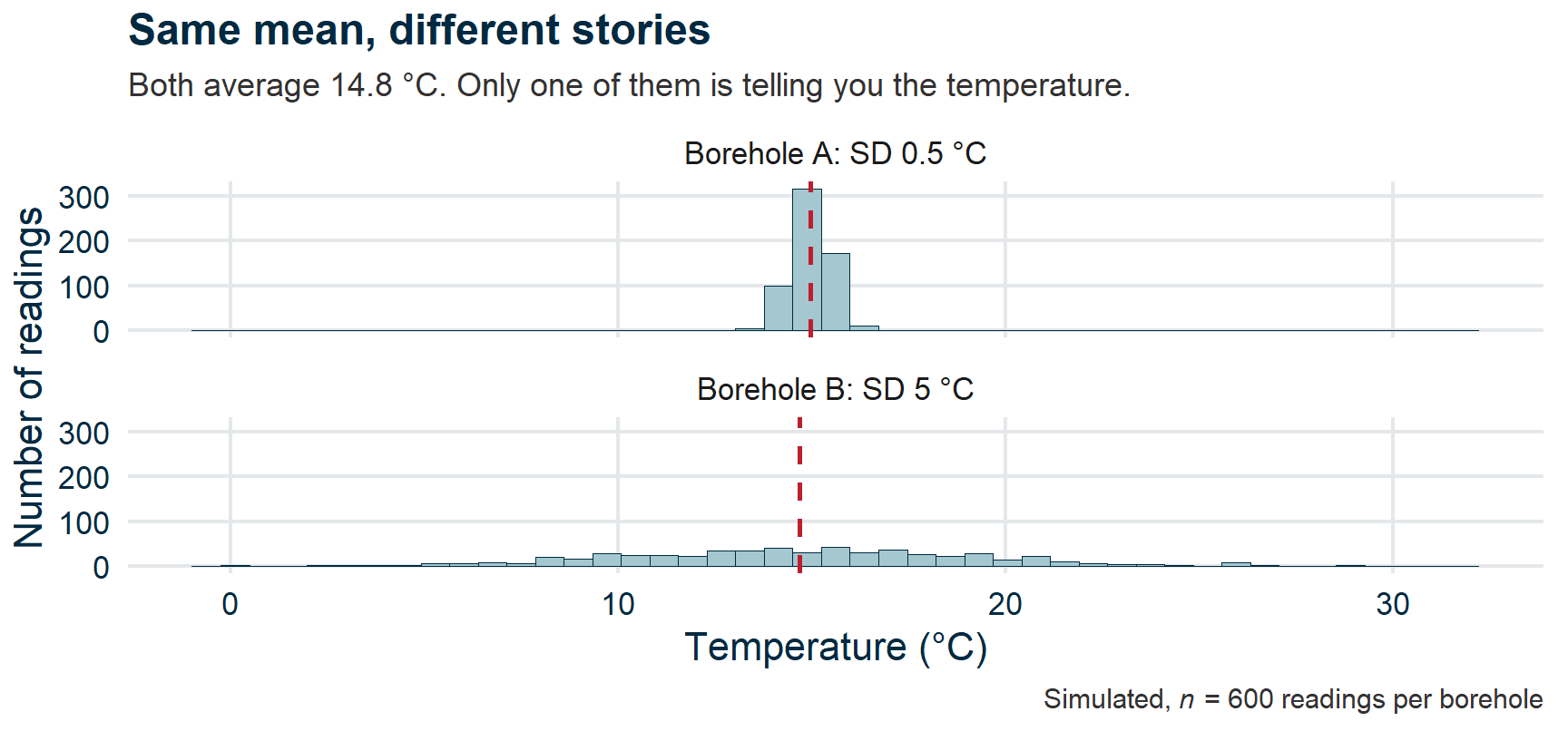
Spread matters as much as centre. A mean of 10 with SD of 1 is very different from a mean of 10 with SD of 50.

Why spread matters

Two histograms of borehole temperature on a shared axis, both centred on 15 degrees. Borehole A is a narrow spike a degree wide. Borehole B sprawls from about 0 to about 30 degrees. A dashed line marks the mean, in the same place on both.

Shape

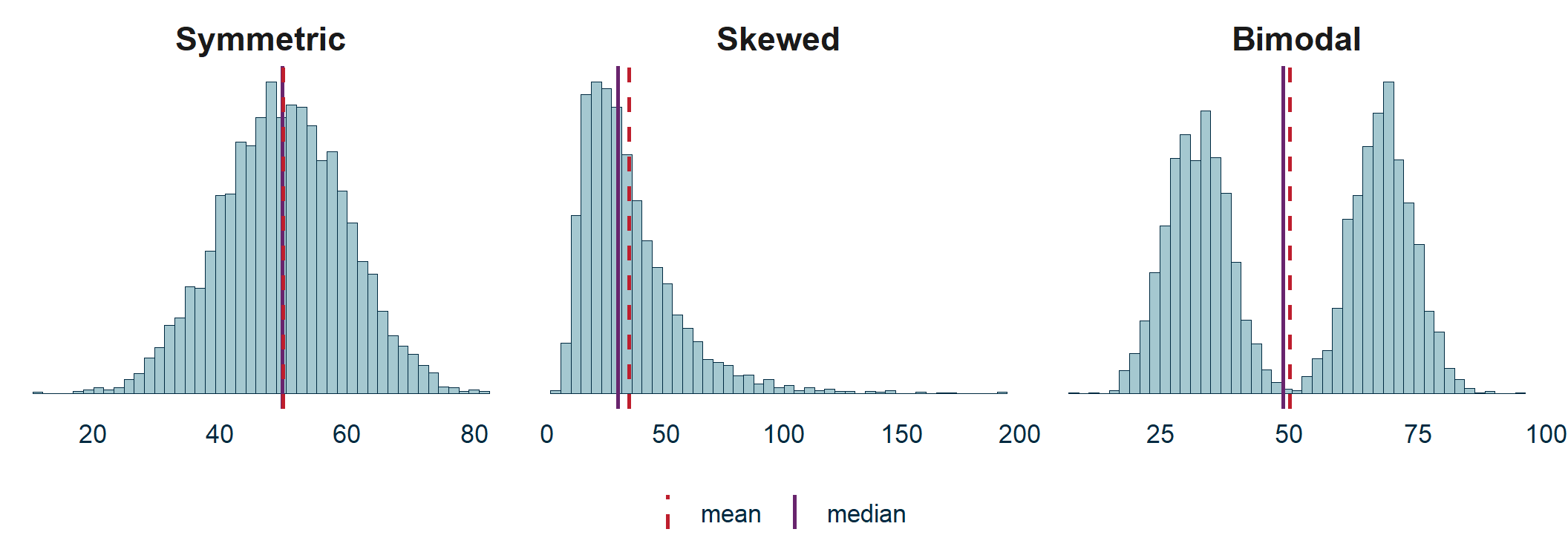
Three histograms side by side. Symmetric: mean and median coincide at the peak. Skewed: the mean sits to the right of the median, pulled by a long tail. Bimodal: two separate humps, with mean and median both falling in the empty valley between them.

Skewed: the mean chases the tail — income, grain size, ore grades.

The two-humped problem

On the bimodal panel, the mean and median both land in the valley — a value that describes almost none of the data.

Two populations. Report one average and you have described neither.

Camelus bactrianus — PhyloPic, CC0

Always look at the distribution, not just the mean.

“Is that a big number?”

  • Recap
  • Summarizing data

💬✏️ Exercise 1

  • Data visualization
  • Spot the lie
  • Distributions
  • Your first ggplot
  • Wrap-up

The More or Less principle

Portrait of the economist and broadcaster Tim Harford.

Tim Harford, who presents BBC Radio 4’s More or Less.
PopTech, CC BY-SA 2.0

A number without a comparator is meaningless.

Try these

UK biomass electricity: 38 TWh/year.

Big or small? Compared to what?

Total UK electricity is ~320 TWh. So biomass ≈ 12%.

Try these

Drax power station emits 12 Mt CO₂/year.

UK total CO₂: ~340 Mt. Drax is ~3.5% of the national total — from one building.

Try these

A single wind turbine produces about 6 GWh/year.

A UK household uses ~3,500 kWh/year. One turbine ≈ 1,700 homes.

The habit

Every time you see a number in this module, ask:

“Is that a big number?”

And its companion: “Compared to what?”

Data visualization

  • Recap
  • Summarizing data
  • “Is that a big number?”

🎓💻 Concept block 2

  • Spot the lie
  • Distributions
  • Your first ggplot
  • Wrap-up

What makes a good figure?

  1. Show the data — don’t just summarize
  2. Make comparisons easy — same axes, same scales
  3. Don’t distort — honest axes, honest encodings
  4. Label clearly — axes, units, captions

Bad figures

  • Truncated y-axes
  • Dual y-axes
  • 3D bar charts
  • Pie charts for non-compositional data
  • Cherry-picked date ranges
  • Misleading area encodings
  • Missing labels or units
  • Colour that obscures rather than reveals

Four of these, right now. Three more in the exercise.

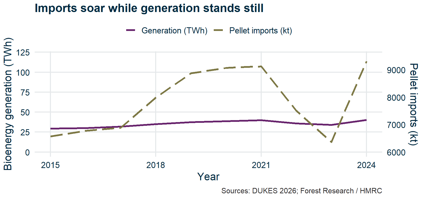
The dual axis

Line chart with two y-axes. Pellet imports, on a right axis truncated to 6000-9500 kt, swing from the floor to the ceiling, while bioenergy generation on a 0-120 TWh left axis looks flat. Both series in fact grew by about 40%.

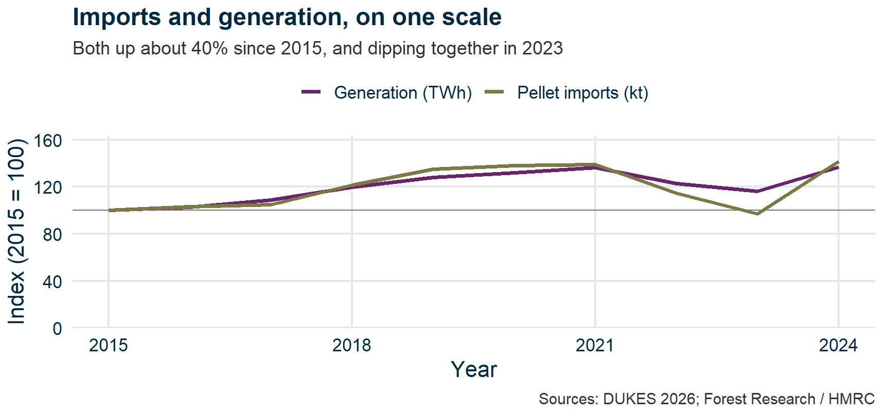
The dual axis, fixed

The same two series indexed to 2015 equals 100 on a single axis. The lines lie almost on top of each other, both rising to about 140 by 2024 and dipping together in 2023.

Fix: put both series on one scale. Indexed to 2015, imports and generation move together — which is what you would expect if the pellets are being burnt at a roughly constant efficiency.

The 3D bar chart
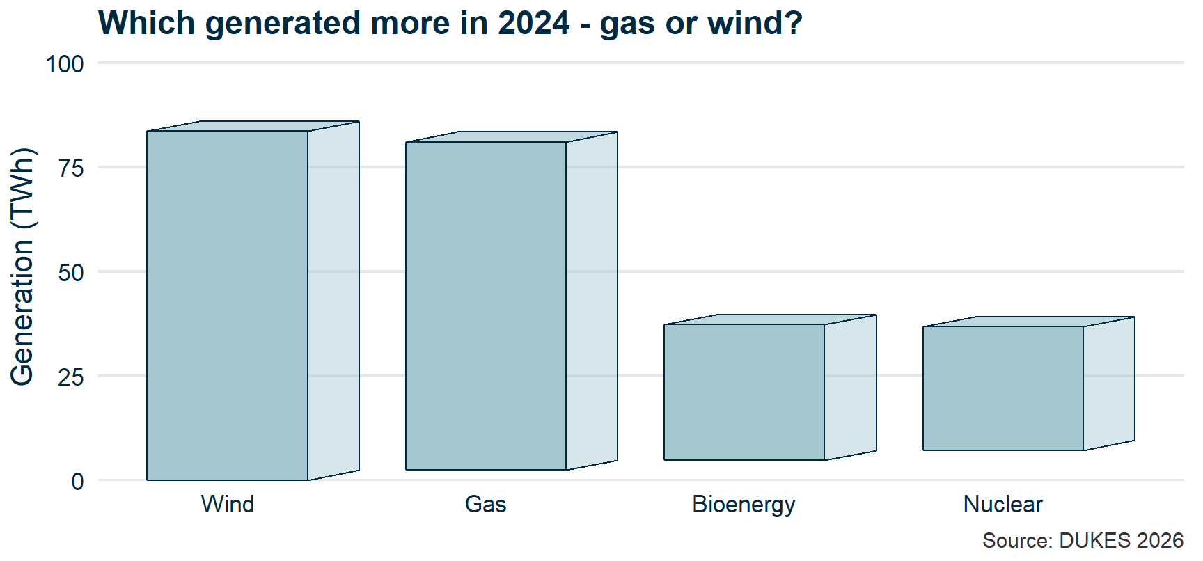
Four bars drawn in fake perspective, each 10% shorter than the one in front. Wind reads as taller than gas and bioenergy as taller than nuclear, though in both pairs the true ranking is the reverse.

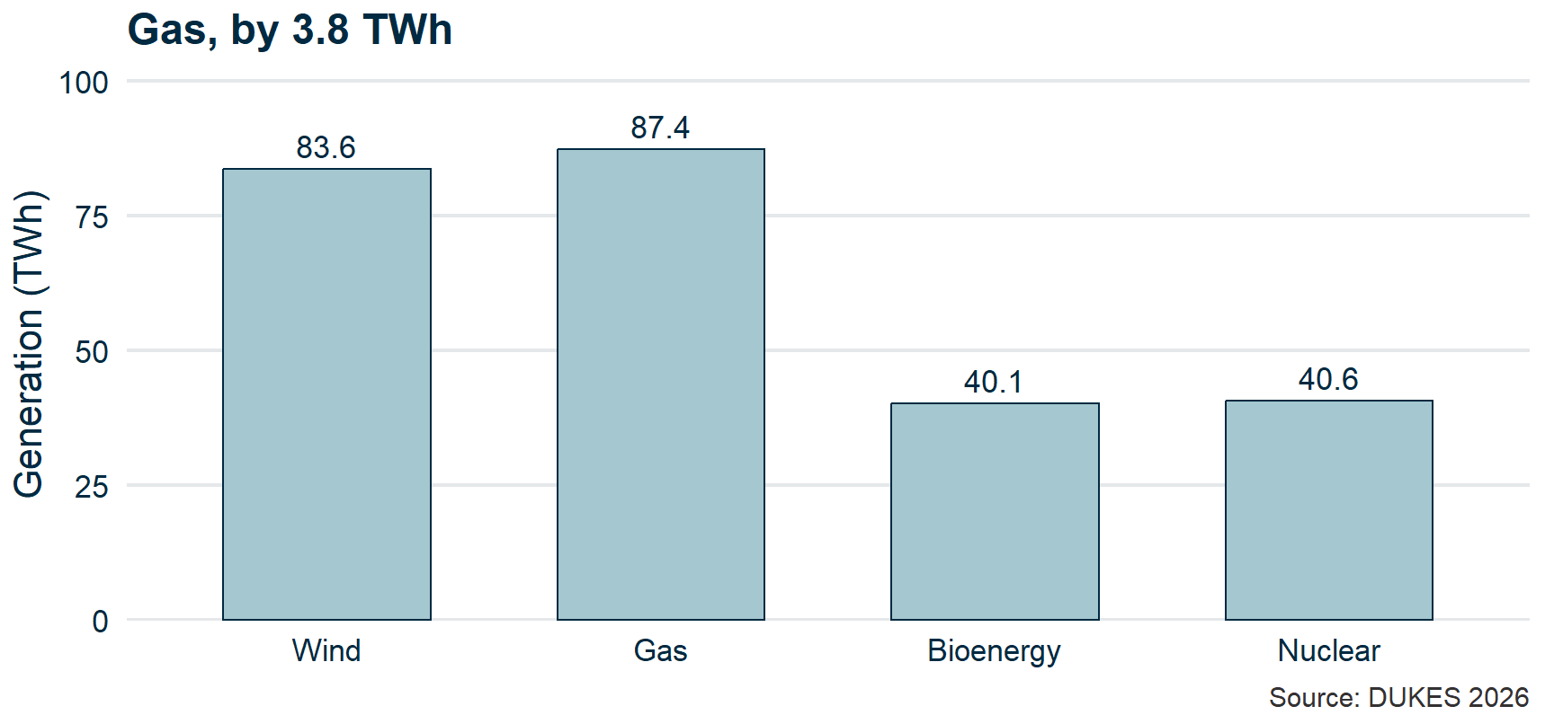
The 3D bar chart, fixed

The same four fuels as flat bars in the same order, with values printed: wind 83.6, gas 87.4, bioenergy 40.1, nuclear 40.6 TWh. Gas beats wind and nuclear beats bioenergy, reversing the 3D version.

Fix: no third dimension — there is no third variable. Where the gap is smaller than the ink, print the numbers.

The area encoding
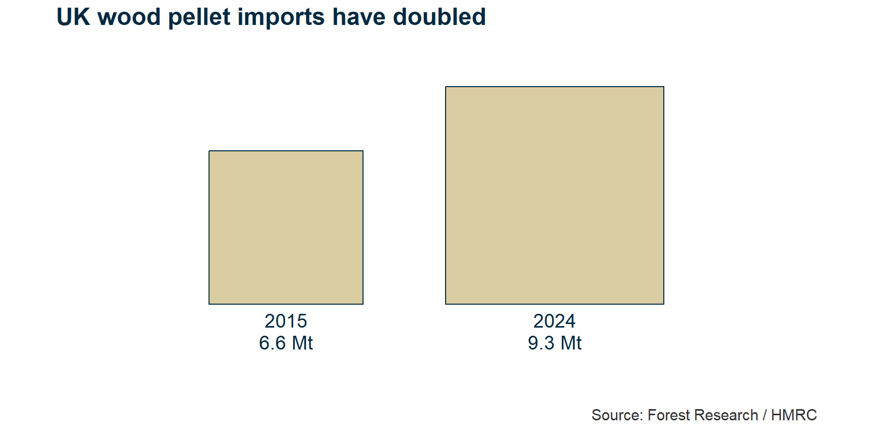
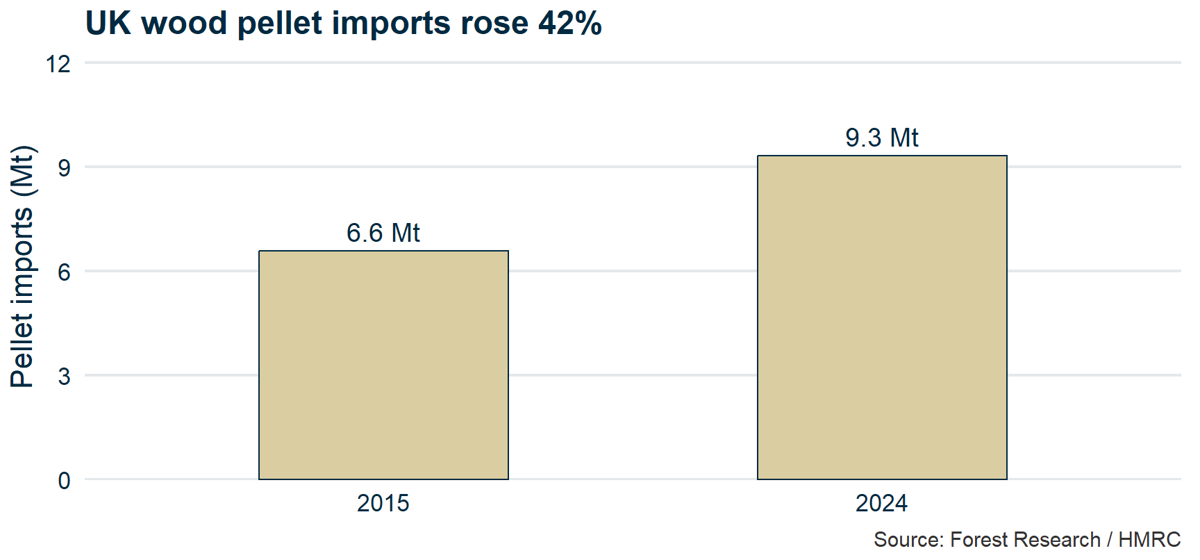
Two squares captioned 6.6 Mt for 2015 and 9.3 Mt for 2024, with each square's side drawn in proportion to the tonnage. The 2024 square covers twice the area, though imports rose only 42%.

The area encoding, fixed

The same two tonnages as bars from a zero baseline against a labelled axis, 6.6 Mt in 2015 and 9.3 Mt in 2024 — a rise of 42%.

Fix: encode with length from a common baseline. It is the one channel the eye reads accurately — and it comes with an axis to check.

Colour that obscures
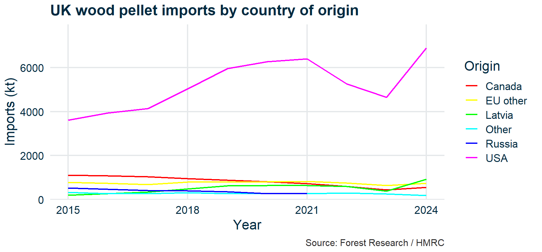
Six thin rainbow-coloured lines of UK pellet imports by origin, with an alphabetical legend to one side. Five of the six lines are crowded near the bottom of the panel and cannot be told apart.

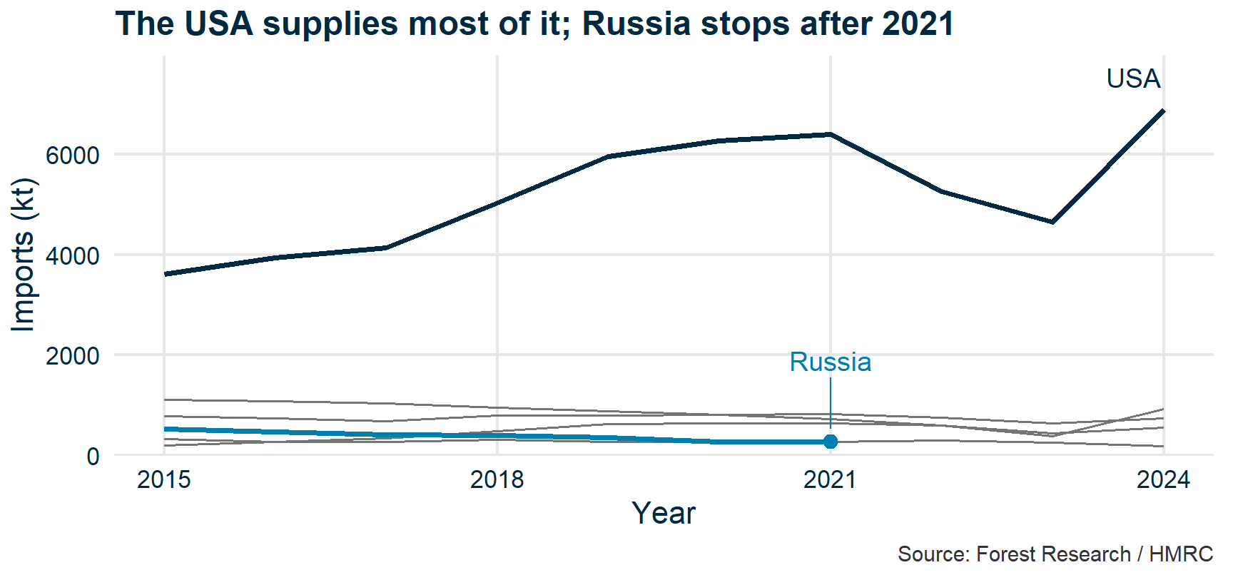
Colour that reveals

The same six series with the USA in dark blue and Russia in cyan, each labelled beside its line, and the four smaller origins in grey. The USA line dominates; the Russian line ends at a dot in 2021.

Fix: colour the story, grey the context, label on the line. Colour is a scarce resource — spend it where the reader should look.

Live demo: building a ggplot

The grammar of graphics

ggplot(data, aes(x = ..., y = ..., colour = ...)) +
  geom_point() +   # geometry
  labs(...)         # labels

Data + Aesthetics + Geometries = a plot.

Data: A plot is just one way of displaying the data. Analyses don’t start with “I’d like to see a bar chart”, but with “What do these data tell me?”

Aesthetics: Translation layer: Which variable controls which visual channel? Channels: x, y, colour, plotting symbol…

Establishes the rules – doesn’t plot anything itself.

Geometries: What physical mark displays the visual channels?

Everything in ggplot2 follows this pattern.

Spot the lie

  • Recap
  • Summarizing data
  • “Is that a big number?”
  • Data visualization

✏️ Exercise 2

  • Distributions
  • Your first ggplot
  • Wrap-up

Instructions

I’ll show you some deliberately misleading charts.

For each one: what’s wrong, and how would you fix it?

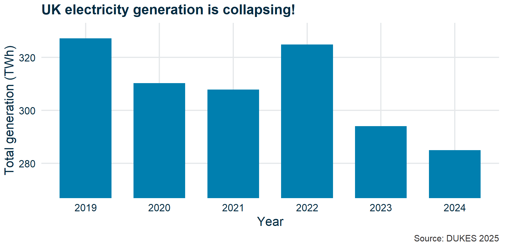
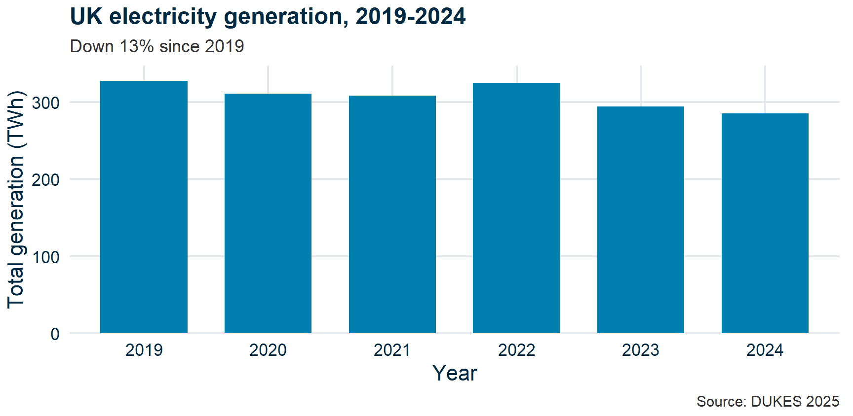
Chart 1: The truncated axis

Bar chart of UK total electricity generation, 2019 to 2024, with the y-axis starting at 270 TWh. The 2024 bar appears a small fraction of the 2019 bar, although generation fell only about 13%.

Chart 1, fixed

The same six bars with the y-axis starting at zero. The bars are of nearly equal height and the 13% fall from 2019 to 2024 is a modest step down, not a collapse.

Fix: Start the y-axis at zero for bar charts. The bar’s length encodes the ratio, so a non-zero baseline breaks the encoding.

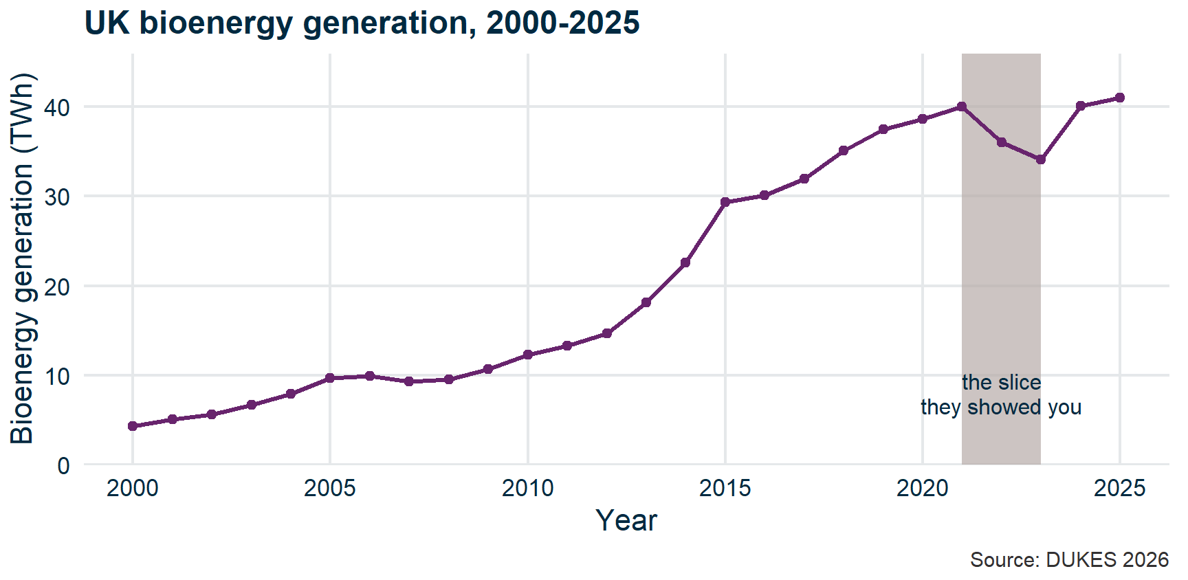
Chart 2: The cherry-picked date range
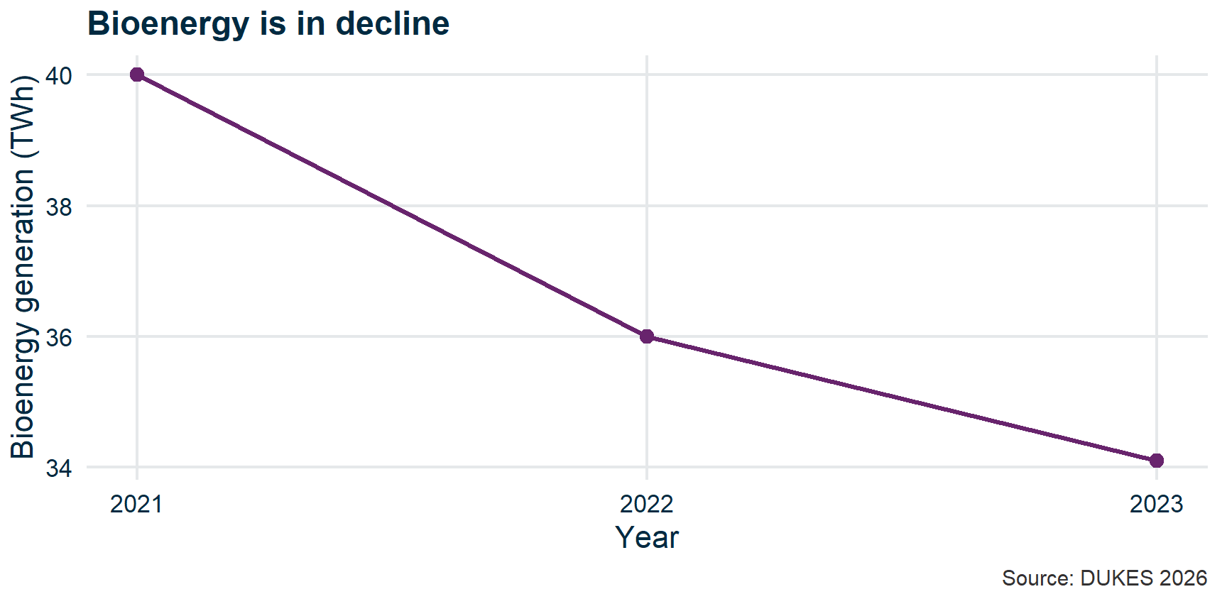
Line chart of UK bioenergy generation for 2021 to 2023 only, falling from 40 to 34.1 TWh. The window omits the rise from 4 TWh in 2000, so a long upward trend reads as a decline.

Chart 2, fixed

The full 2000 to 2025 bioenergy series rising from about 4 TWh to 41 TWh, with the 2021 to 2023 window shaded and labelled 'the slice they showed you'. The dip is three years inside a roughly ninefold climb.

Fix: Show the full time range. Bioenergy grew from 4 TWh (2000) to 41 TWh (2025) — a nearly tenfold increase hidden by that window.

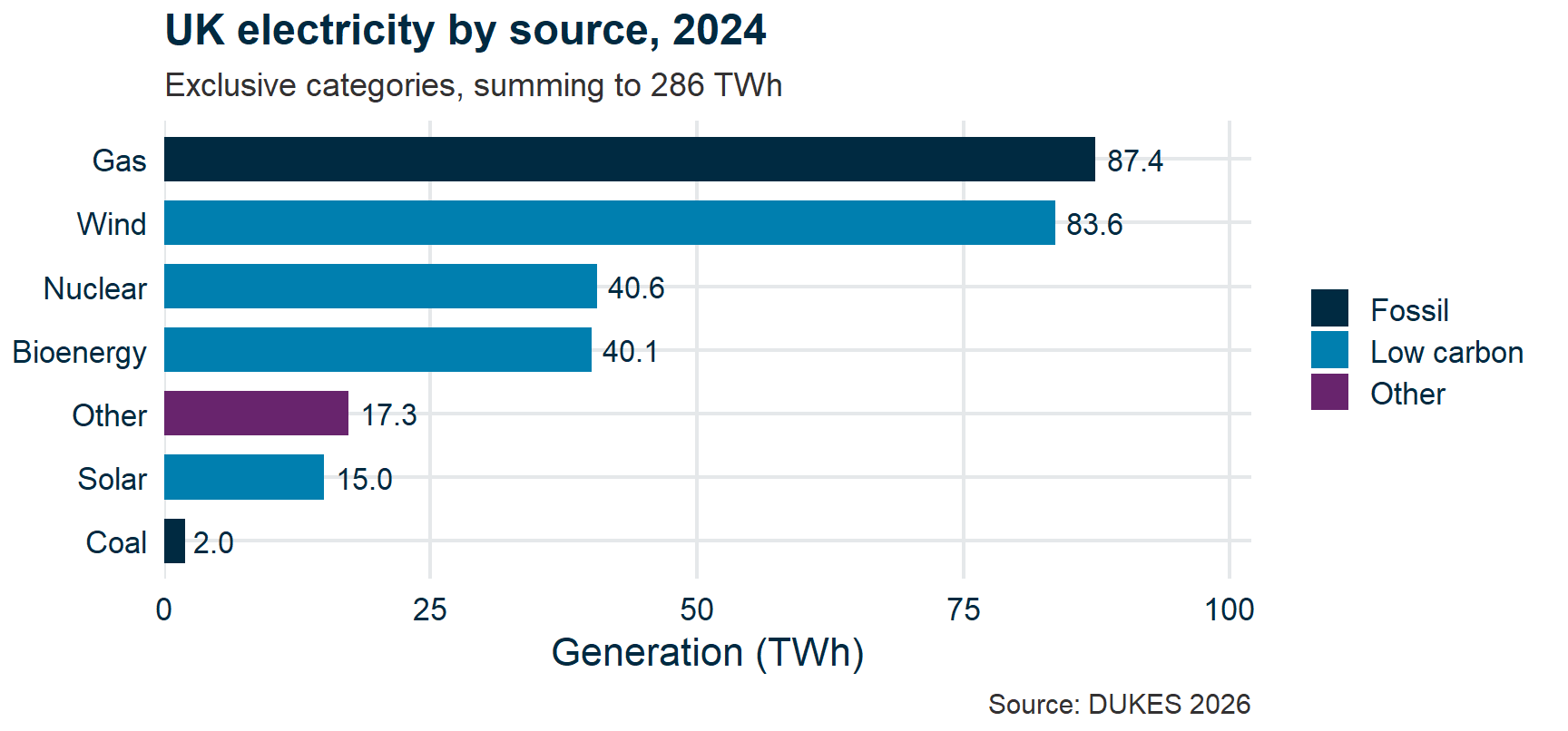
Chart 3: The misleading pie chart
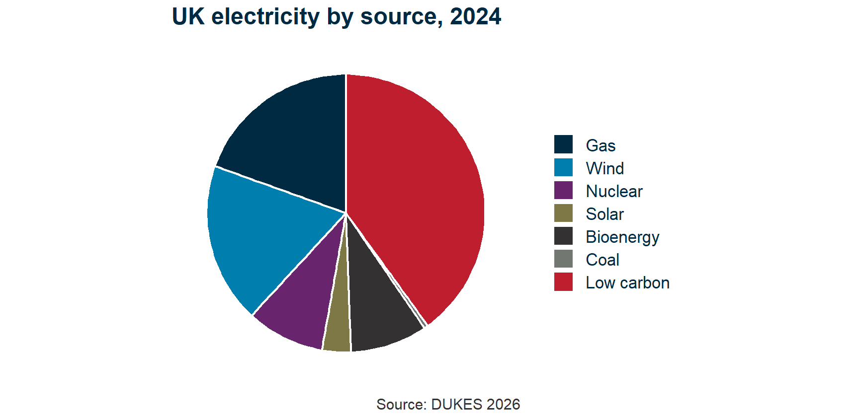
Pie chart of UK electricity by source for 2024 with seven slices, including a Low carbon slice that repeats wind, nuclear, solar and bioenergy. The slices total about 448 TWh against an actual 286 TWh.

Chart 3, fixed

Horizontal bar chart of 2024 UK generation by exclusive source, sorted and labelled, from gas at 87.4 TWh down to coal at 2.0. Low-carbon sources are shaded rather than given a slice of their own, and the bars sum to the 286 TWh actually generated.

Fix: “Low carbon” double-counted Wind + Nuclear + Solar + Bioenergy, so the slices summed to 156%. An overlapping category is a shading, not a slice — and bars are sortable, labelable, and they add up.

Homework: audit some real charts
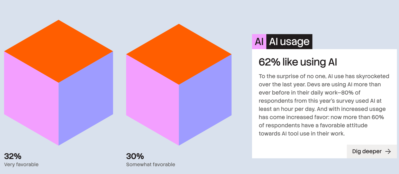
A real, professionally designed report. Almost every chart in it is bad.

  1. Pick a chart. Audit it on your own.
  2. Post your audit in Chart audit on the class board.
  3. Then read what everyone else wrote.

Link on Blackboard, and on the course site under Reference.

Distributions

  • Recap
  • Summarizing data
  • “Is that a big number?”
  • Data visualization
  • Spot the lie

🎓 Concept block 3

  • Your first ggplot
  • Wrap-up

Why distributions matter

A histogram shows you what the mean and SD cannot:

  • Is the data symmetric or skewed?
  • Are there outliers?
  • Is there more than one cluster?

The normal distribution

The familiar bell curve. Appears when many small, independent effects combine.

Central Limit Theorem (informally): averages of large samples tend toward normal, even if the underlying data aren’t.

This is why so many statistical tests assume normality — and why they often work even when the raw data are messy.

Log-normal distributions in geoscience

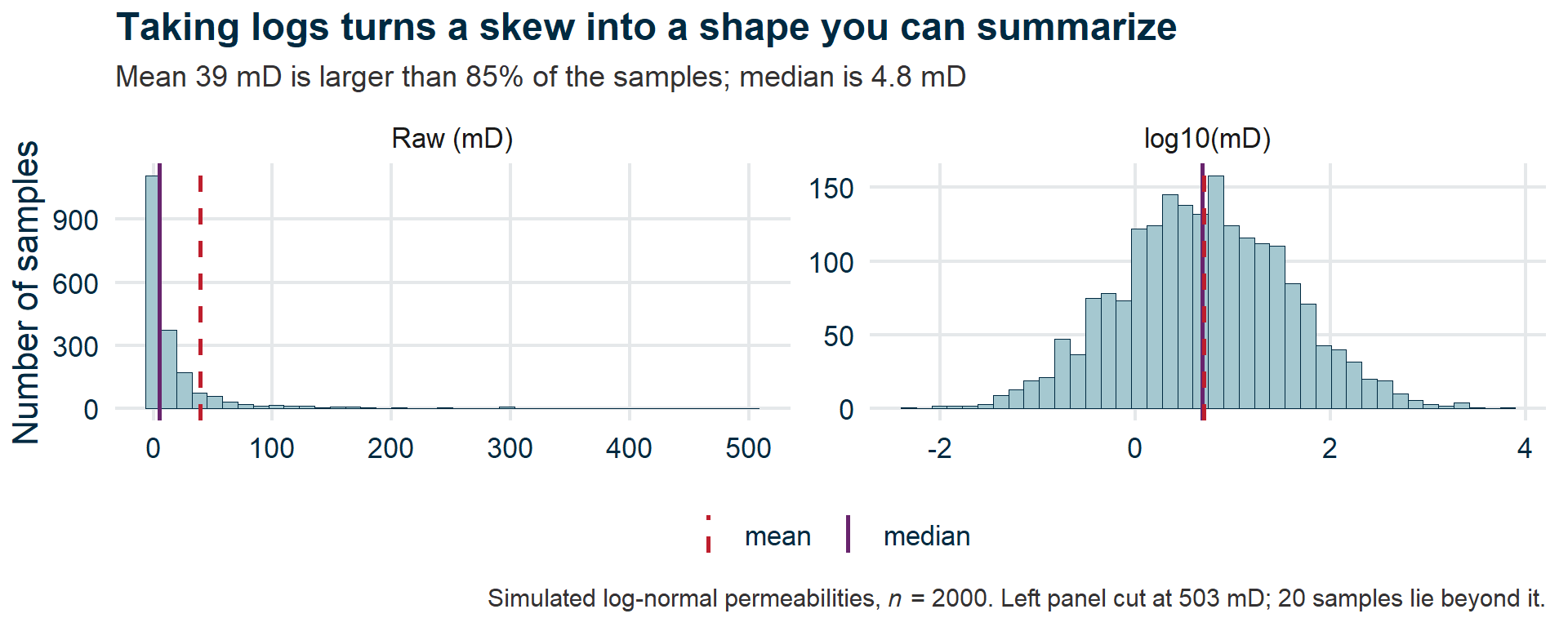
Many geological measurements are log-normal: skewed right, with a long tail of large values.

  • Grain size
  • Permeability
  • Ore grades
  • Earthquake magnitudes

When data are log-normal, the mean can be very different from the typical value.

What that looks like

Two histograms of the same simulated permeabilities. Raw, the data pile against the left axis with a long thin tail, and the dashed mean sits well to the right of the solid median. On a log10 axis the same data form a symmetric bell and the two lines coincide.

When to log-transform

If your data:

  • Are positive (no zeros or negatives)
  • Span several orders of magnitude
  • Are right-skewed

Then log() often makes them more symmetric and easier to analyse.

Your first ggplot

  • Recap
  • Summarizing data
  • “Is that a big number?”
  • Data visualization
  • Spot the lie
  • Distributions

✏️💻 Integrative exercise

  • Wrap-up

Try it

Open WebR. Using the biomass data:

  1. Make a histogram of one variable
  2. Make a scatter plot of two variables with a colour mapping

This is a check that you’re comfortable with ggplot2 syntax before the application session.

Attendance

Wrap-up

  • Recap
  • Summarizing data
  • “Is that a big number?”
  • Data visualization
  • Spot the lie
  • Distributions
  • Your first ggplot

Key points

  1. Always look at the distribution, not just the mean
  2. A number without a comparator is meaningless — “Is that a big number?”
  3. ggplot2: data + aesthetics + geometries

Exit ticket

UK bioenergy electricity output was 41 TWh in 2025. A classmate says: “That’s a lot — it must be making a real difference.”

What’s the most important question to ask first?

PollEv.com/geol

text geol to 07480 781235

Any questions we missed?

Submit questions:

PollEv.com/geol

text geol to 07480 781235

Next time

Application session: “Making the biomass case”

You’ll produce the figures that will go into your briefing.

Further reading

Optional, for anyone who wants to go further with figures: